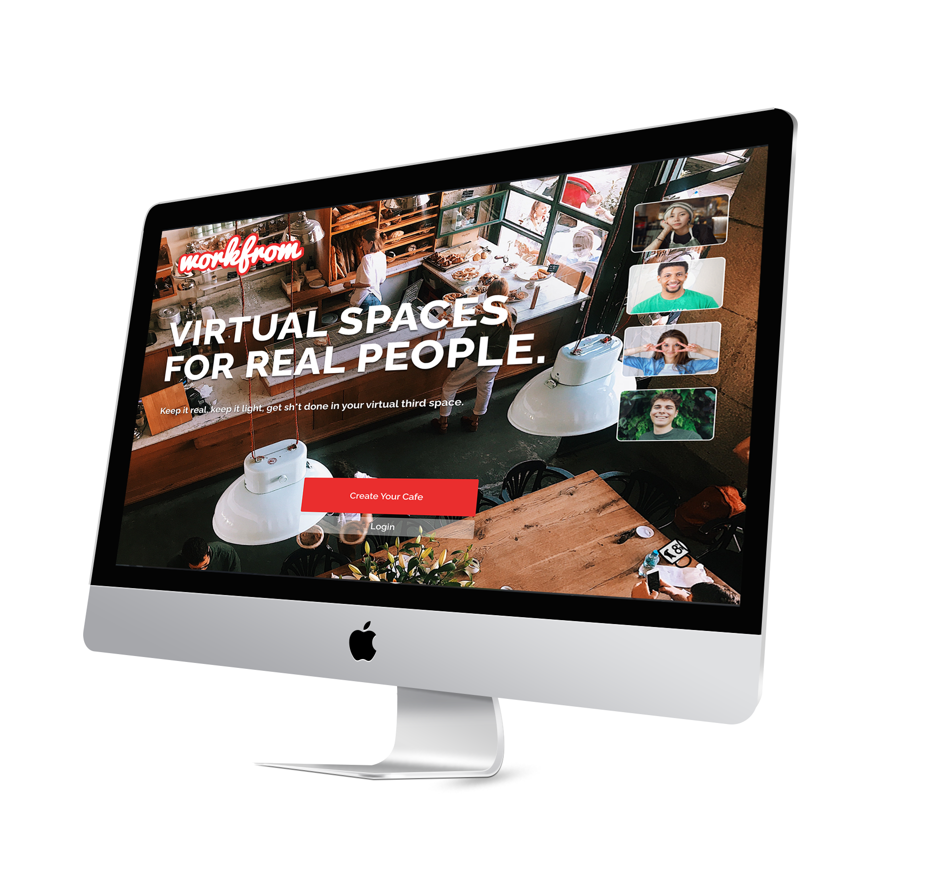
Onboarding Design for Workfrom’s Virtual Cafes
Balancing User and Business needs
The Brief
The client tasked us with designing onboarding for hosts of their custom virtual cafes.
Workfrom allows for users to create a remote work/coffee shop/third space aesthetic in a virtual environment.
Current State Cafes:
Video
Customized Background
Customized Music
Optional Ambient Sound
Bevy of additional customization features
No Voice, Screen sharing, or collaboration features
Currently onboarding is done manually on the back end.
Current state Virtual Cafe environment
The User Needs
Our team investigated why users go to Workfrom over its competitors. We interviewed four current Workfrom cafe users all from different professional backgrounds, all using the cafes for varied purposes. However, despite their differences, they all reported the same emotions regarding the cafes.
Workfrom allows for the community and connectedness of working alongside others in a shared environment.
Users overwhelmingly reported missing the feeling of emotional connectedness more than the aesthetic appeal of a virtual or physical location.
Our data showed that users loved the value offered by the current state cafes, but were less interested in the customization options. Our goal for our first iteration was to create a simple onboarding experience that would get the user into their cafe’s quickly, followed by a feature walkthrough to show the user how to use the host tools.
The Lo-Fi
Our onboarding design featured:
Login
Cafe Purpose (casual, productivity, networking, etc)
Public or Private option
Avatar-led feature tour from within the cafe
Lo-fi Prototype onboarding walkthrough feat. Muggly
Because users reported indifference to customization features we opted to get the user into their cafe as quickly as possible, directing them to the customization features once they are inside their cafe.
Users had previously reported that they had little to no interest in personalizing their cafes but it was a feature our client was excited to showcase to their new users.
Key Takeaways:
Our tests made it abundantly clear that although they were given a simple onboarding process, there was still little interest in the personalization of their site.
Users did not see the purpose for identifying the purpose of their cafes
Public/Private distinction is unnecessary at this time
“I hate Muggly”
The Best Onboarding is no Onboarding
After user testing we realized that after the user logs in, there is nothing that is REQUIRED of them before they use the platform, therefore rendering onboarding irrelevant.
Users who had little interest in playing with the minutiae of the cafes will immediately be dropped into a basic cafe.
Hi-Fidelity changes:
Redesigned Icons for clarity
Reorganized customization tools
Streamlined Style Guide
Improved Copy throughout
Hi-Fidelity Changes
Hi-Fidelity Testing confirmed that even with no onboarding, Workfrom demonstrates its value immediately upon entering the cafe. What the user uses it for, is up to them. While the client sees the platform as a playground of creativity through customization the user sees it as a practical and emotional experience of connectivity. From top to bottom, Workfrom’s value comes in connectedness, emotion, and community.
Hi-Fidelity Walkthrough
Less is certainly more in this case as we learned to let nothing stand in the way of the user and the experience.
Link to full Medium Article.
Interactive prototype (click for fullscreen)


