Part Order Portal Redesign
The Background
The client is a global automotive company looking for a way to combine several touchpoints into one system that would allow for dealers to order, track, and manage repairs for vehicles in their shop, while also giving visibility on the repair status to internal supervisors.
The client created a proof of concept design that was functional, yet needed refinement. The client wanted a portal design that would be intuitive enough for users to complete tasks with little to no training.
This is a request I am very experienced with: a client with an underdeveloped digital tool with known and unknown problems and ask me to “fix it.” To that end, I seek first to understand the business needs and what they perceive as the problems, then validate those perceptions with user testing. From there, I create design solutions that solve the immediate UX and UI issues, meet business goals, and meet users’ expectations for usability, accessibility, and delight.
Current state design as it was delivered to me
The Heuristics Analysis
I began with a thorough UX Audit of the current state to determine the obvious design and UI changes that would help the portal be more usable. I went through the entire portal with an eye for pixel-perfect UI best practices to determine any UI improvements that I would then communicate to the dev team.
Examples of padding and spacing issues with the current state that I presented to the client.
I recommended changes to spacing, typography, iconography, and design throughout the portal. Additionally, I stressed to the client the importance of usability testing. Improving the look and feel would only take us so far. To design a truly functional and usable portal, we would need to conduct usability testing. After hearing my recommendations, the client agreed to testing the portal with proxy users to get a better understanding of specific pain points.
Usability Testing
I conducted usability testing on the portal with 5 proxy users (I insisted on testing with actual users but the client said that would be impossible at this phase of the project). I had the users interact with the current state portal to assess their ability to:
Navigate the various areas of the portal
Complete basic tasks
Judge the look and feel of the portal
The participants were able to complete basic tasks and notes that, while it was a bit confusing at first, “the learning curve was low.” Our usability testing proved that the current state was not “broken” per se, but simply needed some improvement in the areas of navigation and design. Our key takeaways were:
Users experienced friction with navigation and wayfinding when trying to find given areas of the portal
Organization of portal is confusing to users when trying to complete user tasks. Items on the portal are not where users expect them to be
User actions within the portal are not clearly identifiable. No clear indication of where a user can act on a case or part order
The design of screens and UI elements is visually unappealing lacking depth, shadow, or thoughtful use of color
Them Changes
Below are some of the changes I made based on results of the UX Audit and our usability testing, and from internal feedback from stakeholders.
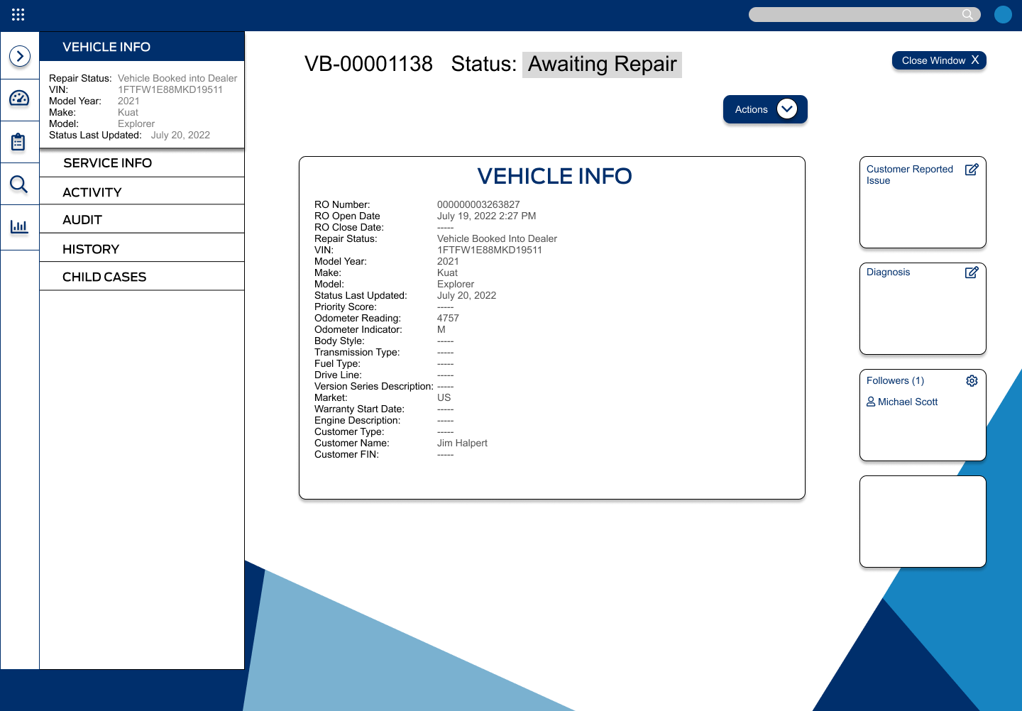
Working with the developers, we relabeled and moved the top buttons into a collapsible side nav that would populate data in the center of the screen. This relates to the user feedback that the current state was not clear which parts of the portal were informational versus actionable.
I also improved the page headings and iconography to help with navigation and wayfinding. Likewise, after getting feedback from stakeholders about display of need-to know information, I put high-level KVIs front and center with options to drill down if users want to dive into those KVIs.
Again, focusing on actionable steps, I improved the part-order screen to include elements required by the client, and improve the UI of the experience based on areas that users struggled with in the process.
Finally, I condensed the data found in the top row of buttons (left) into one pane of glass as a static data container. Again, separating actionable and informational data.
The Deliverable
Delivered redesign for the client based on user feedback
The final deliverable to the client allowed for better data organization that, upon clicking, would change the data view in the center of the screen, while keeping CTAs and key actions on the right of the screen. The large ACTIONS button was placed center-right and would contain the key user actions for the page.
This design approach would solve for user problems of navigation and separation of actionable vs informative data in the portal. Of course, when presenting my design to the client, I recommended further user testing to validate these assumptions and allow for further design iterations.


